Background_
Potential donors were losing their enthusiasm.
Blood Bank of Hawaii puts tremendous effort in recruiting and maintaining its blood donors, but the online scheduling process required too many clicks and was often confusing. As a result, some donors gave up or decided to schedule later—which means they might not return. In addition, the Blood Bank needed to engage new, younger donors. Their current website reflected an older brand that didn’t value the new socially savvy generation.
Insight_
People like to support a good cause. But it has to be convenient.
In today’s busy world, altruism only goes so far. In website terms, that usually means one or two clicks. And so not only did we need to streamline the organization of the website, we also needed to ensure the emotional and community benefits of donating blood far outweighed the time it might take to stop down and schedule an appointment.
Solution_
It feels better than ever to save lives.
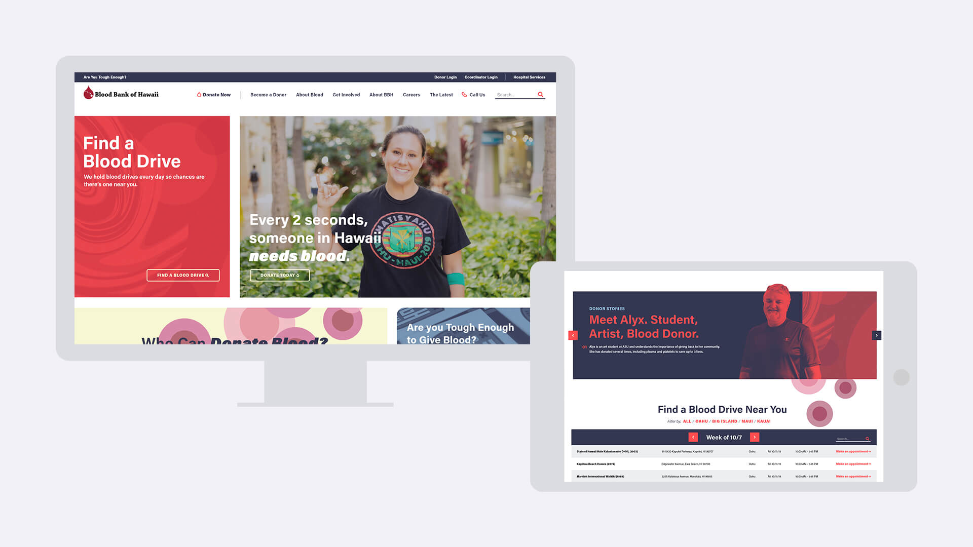
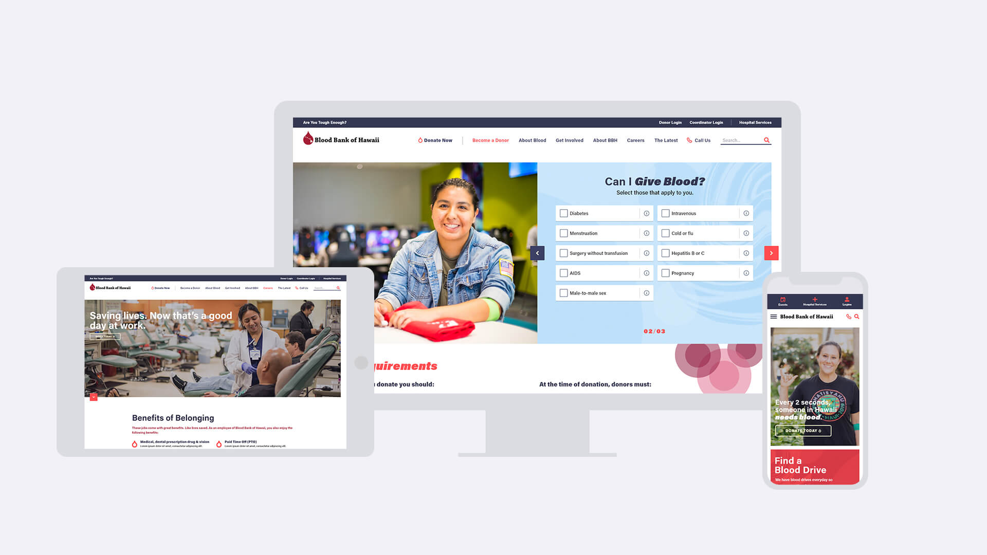
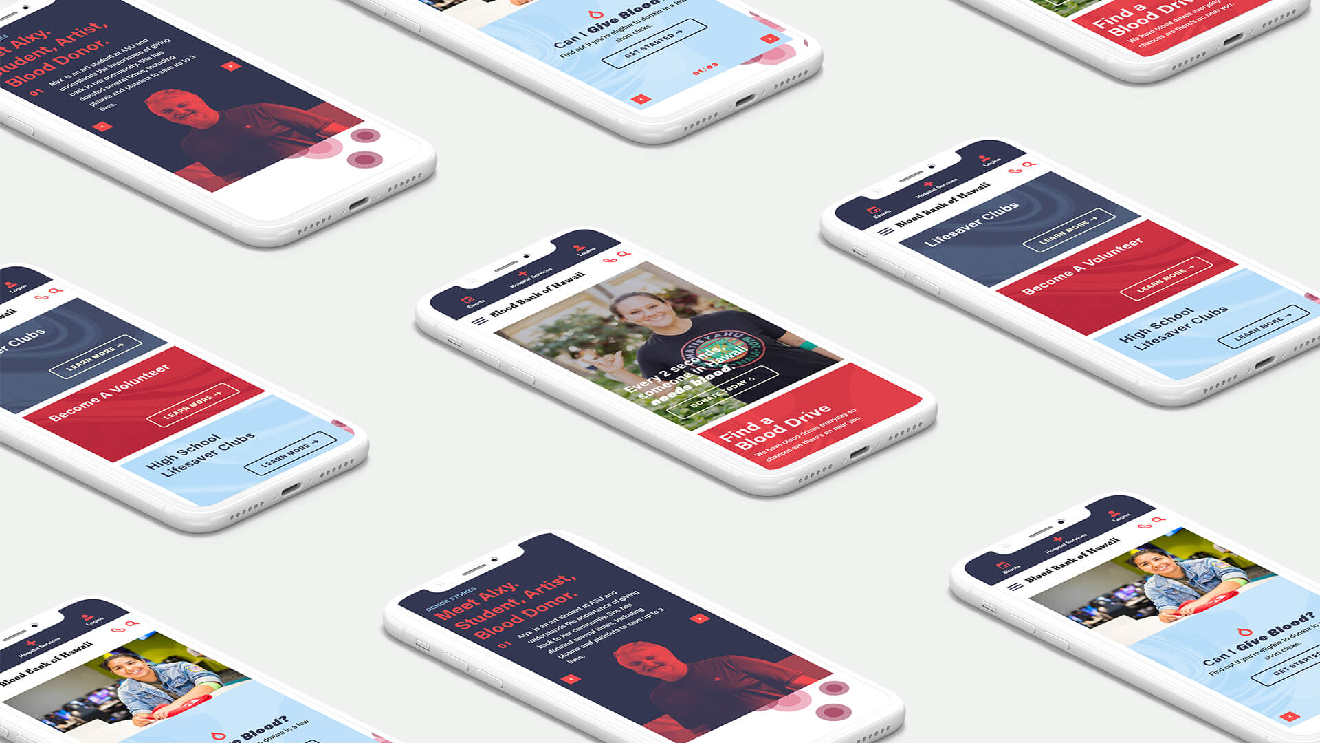
The new Blood Bank of Hawaii’s website captures the feel-good excitement of being a blood donor. There are multiple, streamlined ways to schedule an appointment.
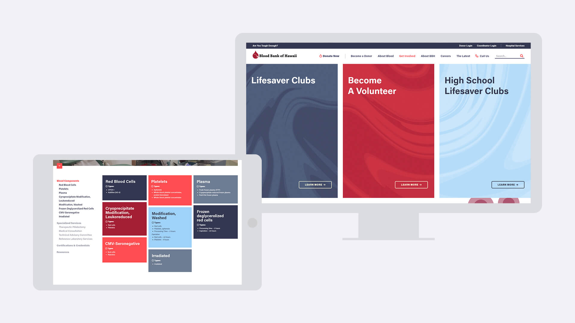
Volunteers can easily access information and download documents. And with personal testimonials and a continually refreshed stream of user-generated content, Blood Bank of Hawaii’s community of donors continues to engage, energize and grow.
Channels_
Branding, Digital, Social
MVNP's Role_
Creative Development, Digital, Social Media, Experiential, Account Management, Public Relations

